
Sea Star Summer is officially out today. I say officially, but in reality, I have to wait till the end of lockdown before I can get my hands on a copy. So in a way, it’s more of an un-book-birthday or a book un-birthday.

The gorgeous cover was designed by Cape Town mixed-media artist Catherine Holtzhausen. Catherine has a BA in Visual communication from the Stellenbosch Academy of Photography and Design and earns her living from illustrating and personal commissions.
Catherine dealt with my publisher directly, so it was a wonderful surprise to see the final cover. The brief centred around the ocean and the character of Naomi, who does a lot of self-reflection during her holiday in Jeffreys Bay.
The cover shows a girl looking out over the ocean, surrounded by coastal vegetation, shells and the waves.
I asked Catherine to share some of what went into the design and what inspired the whimsical paper-craft creation.

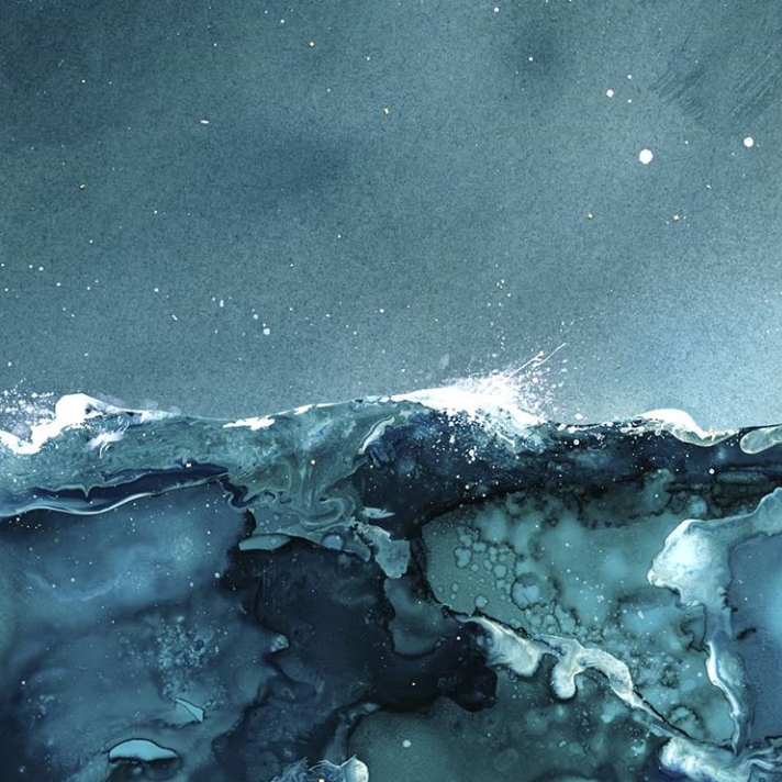
What scene does your artwork depict?
I chose to bring to light the inner storm and glimmers of beauty from Naomi’s journey of self discovery. You can see the storminess of the sea and the dark skies yet she is positioned high above it all on a beautiful hill in a powerful stance with the wind blowing her hair.
What materials did you use to create this design?
The artwork is a collage of hand-painted and cut-out paper, and different painting and printmaking techniques. The sea was created with alcohol inks and the wave splatters were added afterward with a combination of alcohol ink and acrylic ink. The sky was created using ink and water. The biggest conglomeration of techniques was used for the foliage. I have an archive of paper I make using printmaking techniques such as monoprints, colographs, marbling, linocut, and then just conventional painting with various types of paint. These papers are then cut by hand with fine scissors to create the various plants and leaves.
What materials do you like working with the most?
Lately I have been obsessed with inks. It’s a very meditative medium to work with, but honestly whatever new technique I discover or something I haven’t used in a while tends to be my favourite at the time.

In the book, I write a lot about the different moods of the ocean. What is the ‘mood’ on your cover?
I wanted to depict the sea as restless and anxious as an outward visualisation of Naomi’s emotional inner turmoil and confusion.
Do you take a lot of inspiration from nature?
Very much so! I draw almost all my inspiration from nature and how it affects the human spirit. I suffered a very severe burnout a few years back and nature was my salvation. I would go for short little hikes in the mountain every day while in recovery and walk on the beach with the salty wind in my hair after therapy sessions. I often felt far more healing was happening on the beach than in therapy. (But don’t tell my therapist) My mom is also a queen gardener and I recently got into gardening myself. I find myself jealous of how beautiful some of my plants are compared to my artworks.
Follow Catherine on Instagram.
I’m so in love with this cover and can’t wait to see it up close. What do you think?
You can pre-order Sea Star Summer from Raru for R150 and use Code RCCLOCKDOWN5 at checkout to get an extra 5% off.
